With WordPress powering over 42.9% of all websites, it’s hard to pinpoint another piece of software that has had a greater impact on the state of web accessibility. WordPress is popular for good reason.
Some of the obvious reasons that come to mind include the following:
- It’s open source (no license fees)
- It has a reasonable learning curve
- It can be used for simple websites and can be the backbone of web applications
- There is a strong community behind it, contributing services, plugins, themes, and to the core project itself
With WordPress, even non-technical people can get a website online in a matter of minutes. Those with more robust needs have extended WordPress into an application framework, powering rich web applications like Pressbooks and YouTooCanRun.
But how accessible is WordPress out of the box? How difficult is it to keep WordPress accessible? And how can you ensure your WordPress website is accessible? That’s the topic of this article. Let’s dig in.
How Accessible is WordPress out of the Box?
WordPress can be very accessible out of the box. The WordPress project has a dedicated accessibility team that continually works to improve WordPress with the aim to “make the WordPress Admin and bundled themes fully WCAG 2.0 AA compliant where possible.”
In practice, what does that mean? The latest official bundle of WordPress themes (the templates that dictate the look, feel, layout, and sometimes functionality of your WordPress site) have been evaluated and vetted against the WordPress Accessibility Coding Standards, which target WCAG 2.0 AA compliance, to be “accessibility ready.”
From an authoring standpoint, WordPress as a tool aims to conform with W3C’s Authoring Tool Accessibility Guidelines 2.0, or ATAG, but it does not currently do so. This is no easy task, however, as ATAG not only stipulates that the application be accessible for those with disabilities; it encourages all users to create accessible content and to repair accessibility mistakes, all without additional tools or add-ons.
Accessibility team contributor Joe Dolson had this to say about the current state of WordPress accessibility:
“The front-end of WordPress is pretty much in the same place it’s been for years: perfectly capable of being accessible, but it entirely depends on the developer building the site. A poor theme or inaccessible plug-ins make all the difference. The admin has continued to improve—it’s been a hard road to move the Gutenberg editor along towards better accessibility, but progress is being made. That said, it’s a constant battle to avoid accessibility regressions with any new interface component.”
In short, the WordPress community values the importance of accessibility, and it has applaudable accessibility goals, but it still has progress to make. There are still accessibility shortcomings within WordPress out of the box; it is difficult for people with disabilities to author content in WordPress, for example, and it is hard to ensure that content authors don’t create inaccessible webpages.
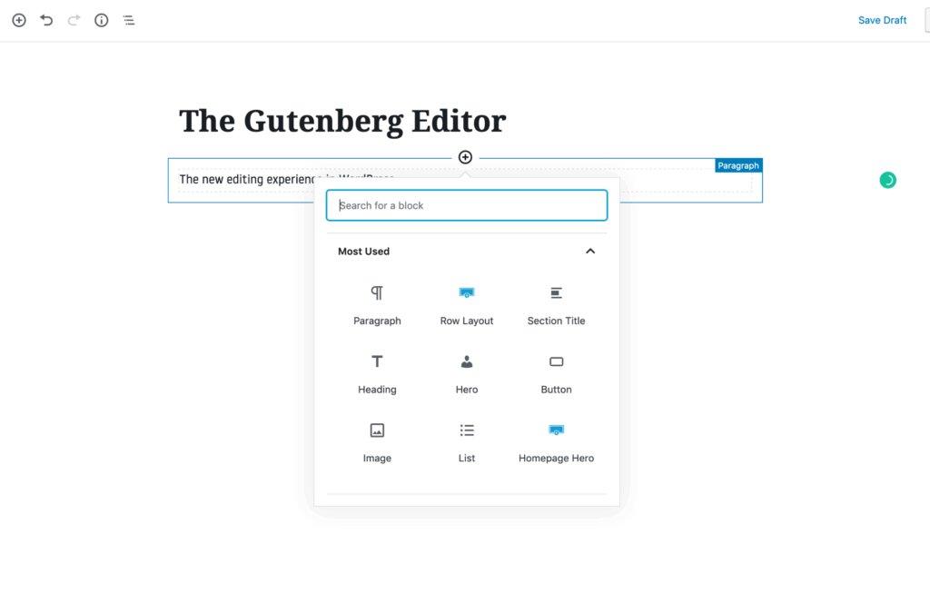
As Dolson mentioned, one notable area that needs improvement is the (relatively) new Gutenberg editor. Gutenberg is WordPress’s current content-editing experience and was released with WordPress 5.0 in December 2018. Gutenberg replaced TinyMCE, a fairly common, open-source WYSIWYG (what you see is what you get) editor that was bundled with WordPress from 2005 to 2018. TinyMCE is a simple editor akin to Microsoft Word or Google Docs. Editing is primarily text-based and has few capabilities to manipulate layout or add rich content (without manually adding HTML or using WordPress shortcodes).
Gutenberg was designed to give content authors more capabilities and to give them more control over their webpages. Authors now have the ability to add “blocks” to their pages, which can be as simple as a paragraph of text or a bulleted list, or as complex as tabs, columns, testimonials, hero areas, and accordions.
Gutenberg is an important topic in WordPress accessibility because Gutenberg was released despite the knowledge that it had significant accessibility issues. In mid-2019, WPCampus released the results of a Gutenberg accessibility audit they commissioned, which included a link to the CSV file of all 90 issues.
It’s clear that the WordPress and Gutenberg teams are dedicated to improving accessibility. The WPCampus audit notes that four accessibility issues were resolved while testing was being done, and an additional 116 were closed between testing and its release. Of the 90 issues raised, only 32 remain open on GitHub at the time of writing.
“The accessibility team is focused on a few areas. We’re still working on getting the results of the WPCampus audit resolved, and we’d like to see 100% resolution in 2020. We’re continuing to work on improving the block editor, and we’re anticipating that as plans for moving towards full-site editing develop, that will probably create a significant spike of new issues we’ll need to focus on. That timeline is still an unknown, however.”
—Joe Dolson
While that is the current state of WordPress accessibility, you might be wondering, “How do I make my WordPress site as accessible as possible?”
Accessible Websites in WordPress
I’ll be approaching this question with a focus on the “front end” of WordPress websites—the (typically) public pages that WordPress generates—as opposed to the administrative back end.
WordPress, at its core, is a tool for storing, retrieving, and displaying stored data. Typically, this stored data is content. This means that your WordPress website’s accessibility is largely determined by what data is stored and how that data is displayed.
WordPress has two systems that have a significant impact on accessibility: themes and plugins. WordPress themes control how your website looks, and plugins allow you to add additional functionality to your website. Both are responsible for the underlying code that makes up the front end of your website.
That code can be accessible or have accessibility issues. It can include accessibility features such as skip links or proper ARIA roles, or it can neglect them. The theme can or cannot have adequate color contrast.
So much of making WordPress sites accessible is evaluating, testing, and selecting the right themes and plugins.
Let’s look at themes and plugins individually.
Selecting an Accessible Theme
Let’s first talk about selecting an existing theme. Unless it is specifically stated otherwise, you should assume that a theme is not very accessible. Making a theme accessible takes a significant amount of effort and testing, and if someone went through the effort of doing so, chances are they’re going to draw attention to that.
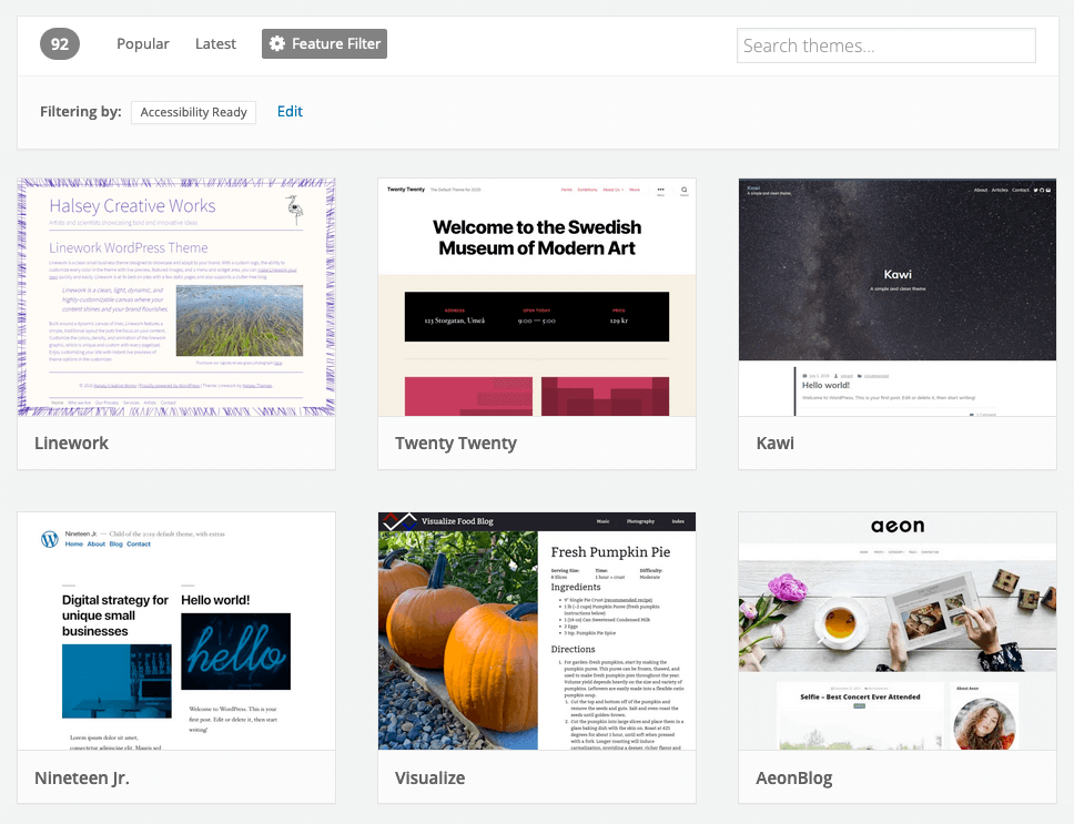
Luckily, the accessibility team has a list of 92 free themes in the WordPress repository that have been vetted and tested for accessibility.
“The theme review team has begun to introduce accessibility requirements as part of the general requirements for all themes, but those are just getting started, so it’ll be a while before accessibility becomes pervasive in the directory.” —Joe Dolson
Now, generally, you get what you pay for. I might sound overly capitalist, but commercial themes typically have more effort, attention, and support put into them compared to free themes. So, if your website is important enough, you might consider a paid theme instead of a free one.
Unfortunately, it’s a bit harder to make a good decision when it comes to paid themes. There really are no checks and balances to ensure a theme advertised as “accessible” or complying with WCAG guidelines actually does so. In fact, many of the themes I came across when researching this article that were labeled “accessibility ready” had glaring accessibility issues.
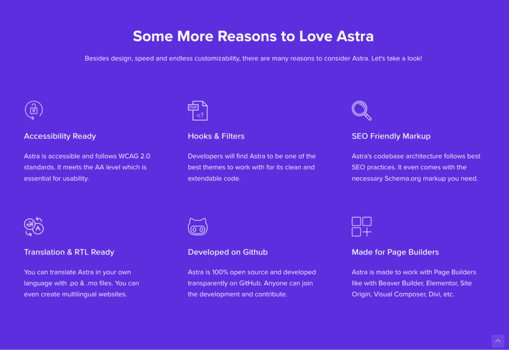
So, my recommendation is to start by researching and looking at long-standing, reputable theme providers like Astra, which in my experience, is pretty accessible out of the box, the WCAG Theme, which has positive feedback, or Avada, which has a commitment to WCAG 2.1 AA compliance.
With any theme, whether free or premium, I highly recommend you do your own testing and not just take the theme provider’s word for it. Recommendations on testing methods are provided later in this article.
“It’s More than Just an ‘Install and Go'”
It’s important to note that you can make an accessible theme inaccessible, either through installing inaccessible plugins or making poor design decisions. The most notable concerns are adequate contrast and using more than just color to convey information. For example, if your links are only identifiable because they’re a different color than normal text, you have an accessibility issue. They need to at least be in a different size, bolded, or ideally, underlined.
In terms of contrast, WCAG 2.0 AA requires a minimum of a 4.5:1 ratio for normal text, 3:1 for larger text (bold 18px or standard 24px and larger), and 3:1 for user-interface components, such as input borders, focus states, and links.
Building an Accessible Theme
If you’re creating a custom WordPress theme, there is a host of considerations you’ll need to consider. Your first step will be to identify what guidelines you need to comply with and to what extent. You can read more about the different guidelines to identify which fits your situation here.
“I’d recommend doing custom development from a starting point like the Underscores starter theme—while it doesn’t offer much in the way of design, it does provide a great basis for the underlying HTML, which is an enormous part of what makes a site accessible.”
While specific requirements will differ, here are some common areas you should address:
Adequate Color Contrast
Ensuring adequate color contrast is a key aspect of web accessibility and usability. A large portion of the world’s population has vision issues and has trouble distinguishing text and interface elements that have poor color contrast.
WCAG 2.0 AA requires a minimum of a 4.5:1 ratio for normal text and 3:1 for larger text (bold 18px or standard 24px and larger). For more on testing contrast combinations, see the testing section.
Perceivable Differences
On a related note, ensure that you use more than color to differentiate. If the only difference between normal text and a text’s link is color, you have an accessibility issue. At the minimum, the text should also be in bold, or better yet, underlined.
This applies to active states, focus states, non-text links, etc.
Keyboard Navigation
Make sure users can navigate your website with a keyboard. Can they tab through all the menus and links on the site? Are focus states on links clear, and do they have enough contrast?
Screen-Reader Navigation
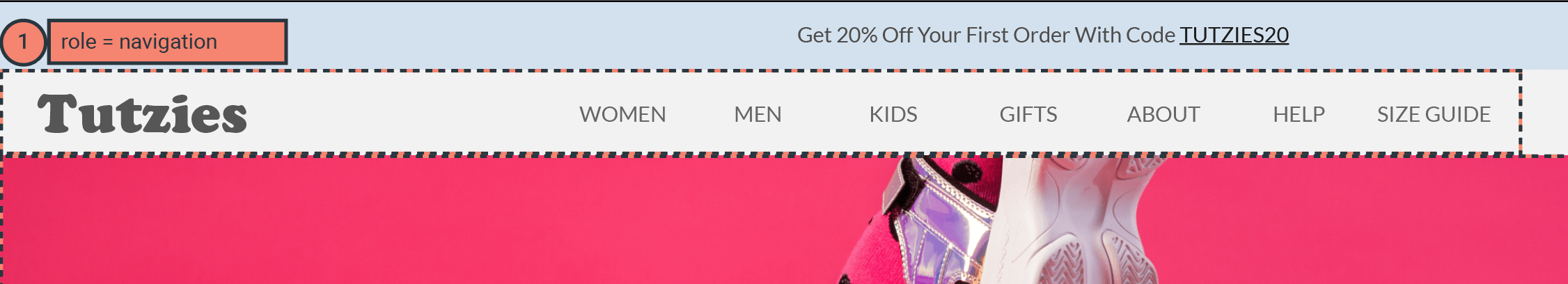
Ensure your theme is built to support screen-reader navigation. This includes creating skip links at the top of the page, using proper ARIA roles and/or HTML5 landmarks for easy section jumping, and ensuring that your links are not ambiguous.
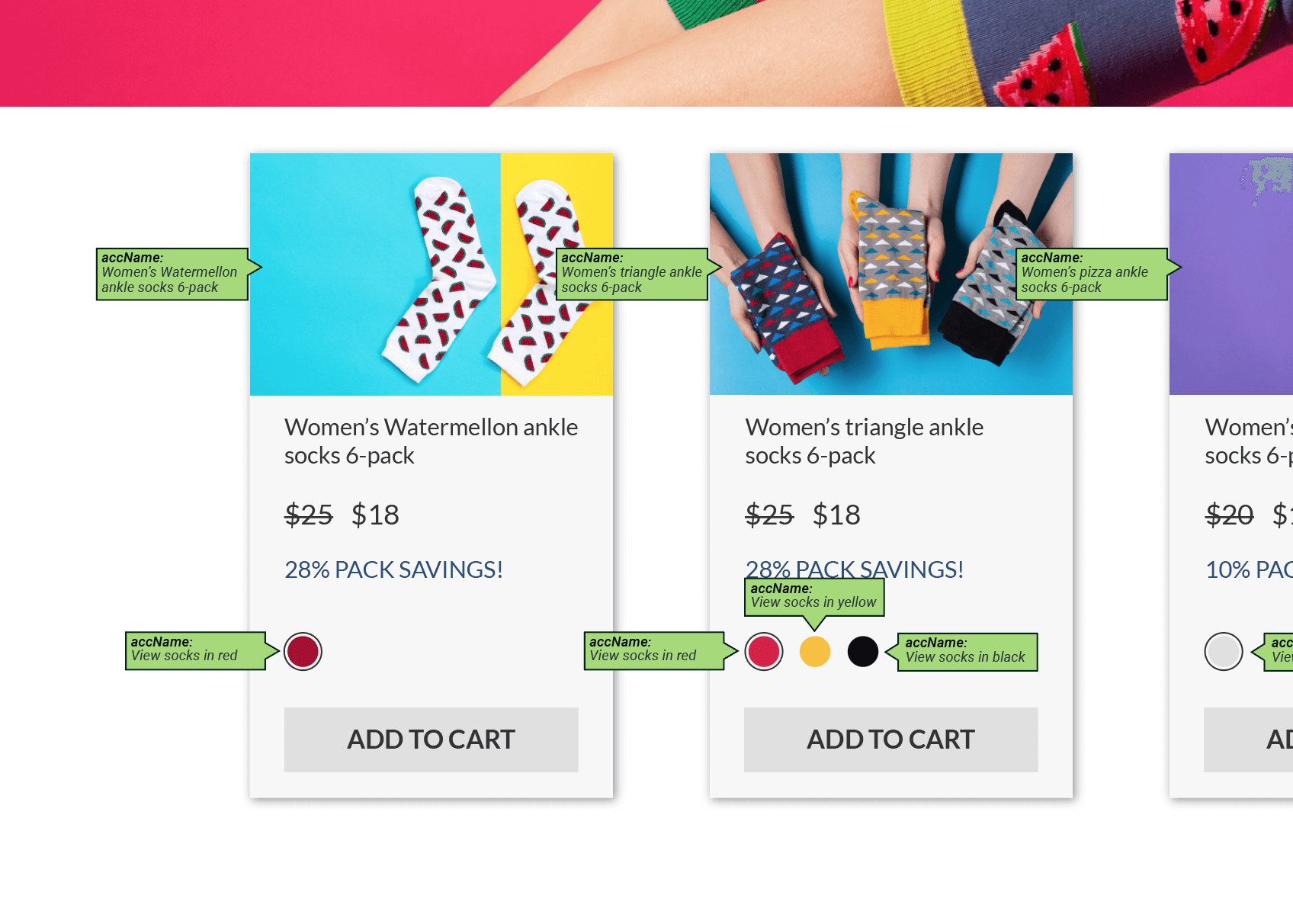
To elaborate more on links, screen readers allow users to navigate a page by jumping from one link to the next. If the link’s text is only “Read More,” it will be unclear what the link pertains to or where it will take the user when it is clicked. Instead, build more descriptive links (e.g. “Read more about our services”), use screen-reader-only text, or use ARIA-label attributes to give screen readers a more detailed description to read from.
Semantic Markup and Markup Quality
As Dolson described earlier, proper HTML markup is a significant factor for web accessibility. Semantic markup means that the HTML code properly describes the content contained within it. That means not using <table> tags for layout, using <ul> and <ol> tags for lists rather than ASCII bullets or typing out numbers, and not using <ul> and <ol> tags for elements that aren’t actually lists.
Heading levels should progress linearly without gaps, meaning before you use an H3 tag, for example, you need to have H1 and H2 tags.
Finally, be careful not to repeat IDs on the page.
While there’s more that goes into creating accessible HTML code, the concepts discussed above are some great high-level concepts to keep in mind as you build your pages.
Text Alternatives for Non-Textual Content
The web has evolved into a media-rich landscape. While engaging, content that’s in anything other than a text-based format can be inaccessible to those using assistive technologies. A screen reader doesn’t know what’s depicted in an image, and therefore can’t describe it without your manual assistance. A podcast can’t be consumed by someone who’s deaf unless you have a transcription.
Make it a practice to provide alternate text, or “alt text,” for any content added as an image/icon, video file, or audio file. This is not necessary if an element is purely decorative.
Resizable Fonts
Ensure your layouts and text support font-resizing. Many users will increase the size of text in their browser for improved legibility. Your theme needs to support that.
This is done by ensuring elements containing text can expand vertically and that font sizes are defined in ems and rems, rather than px.
This is easy to test, as every web browser has the option to enlarge and shrink text. Try enlarging your text three times to see if the font size increases and if the layout breaks.
Allow Users to Stop or Control Motion
If you have any automatic motion or animation, make sure you provide the option for users to control and stop it.
Reference the WordPress Accessible-Theme Coding Standards
The above list is far from exhaustive; there are lots of factors, large and small, that contribute to your custom theme’s accessibility. When it comes time to build your theme, I recommend you reference the WordPress accessible-theme coding standards for more specifics.
Now that we’ve discussed themes, let’s talk about how plugins impact your websites accessibility.
WordPress Accessibility and Plugins
Plugins are one of the most compelling reasons to use WordPress. At the time of writing, there are over 55,000 free plugins in the WordPress repository and thousands of paid plugins as well. Each plugin gives WordPress functionality it didn’t previously have.
With a few quick clicks, you can add new features to your website, such as contact forms, e-commerce functionality, project portfolios, photo galleries, and social networks.
While powerful, plugins are a common cause of accessibility issues. Plugins are only as good or as accessible as they’re created, and since they add or manipulate the code of your website, they can easily introduce accessibility issues.
Simply put, if the plugin wasn’t built with accessibility in mind, it might have accessibility issues. Let’s talk about the common types of plugins where I’ve seen problems.
“It’s hard to make reasonable recommendations for plug-ins however—I have yet to find a way to keep on top of whether or not any given plug-in is accessible or staying that way.”
— Joe Dolson
Interactive Plugins
Any plugin that creates “interactive” elements such as carousels, sliders, dropdowns, menus, pop-ups, accordions, and tabs are ripe for accessibility issues. These types of interactive elements require special care, attention, and testing to ensure accessibility, and it’s rare to find a plugin of this type that has done so. This is regardless of whether the functionality is deployed via shortcode, Gutenberg block, widget, etc.
That’s not to say your website can’t have these features or use these types of plugins and still be accessible; rather, you’ll need to be extra careful in your selection, and I highly recommend testing any plugin before committing to it.
Form Plugins
Like interactive features, forms require special care and attention to ensure assistive technology can properly describe, navigate, and interact with forms and form fields. Labels, error messages, and focus states all need to be treated in the correct way. Otherwise, users with disabilities will have difficulty using these forms. In my experience, most form plugins have accessibility issues. We typically create custom-coded forms as a result.
Page Builders
Page-builder plugins have become extremely popular over the past few years. Simply put, page builders give you a more “drag and drop” experience to building pages on WordPress sites. In many ways, page builders are similar to Gutenberg, only they tend to be more robust and sophisticated.
Page builders can also introduce accessibility issues, and quickly. In my experience, most page builders are accessible when it comes to presenting static content. However, they often include a range of interactive capabilities like sliders, animations, and pop-ups that have accessibility issues.
If you feel you need a page builder to build your site, keep it simple, and stay away from interactive modules unless you’ve tested and confirmed that they’re accessible.
Accessibility Plugins
Until now, we’ve only talked about plugins that could negatively impact your site’s accessibility. What about plugins that improve accessibility? There are nearly 100 plugins tagged under “accessibility” in the WordPress repository, and there are at least a dozen more premium accessibility plugins that I’m aware of. Each of these plugins promises to either improve the accessibility of WordPress itself, monitor accessibility, or remediate accessibility issues for popular plugins and themes, such as Gravity Forms, Divi, and Genesis.
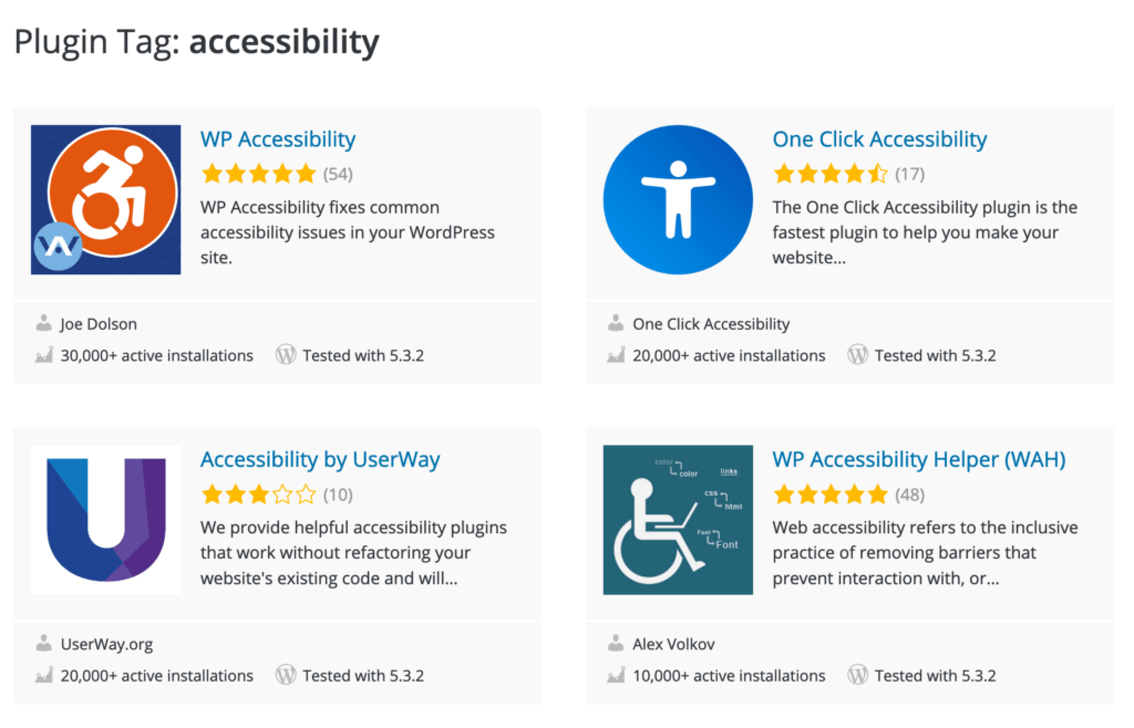
While I’ve only personally used a handful of these plugins, such as themes that claim they’re accessible, I recommend you don’t take plugin promises as gospel. On more than one occasion, I’ve installed a plugin that claimed to correct accessibility issues of a popular plugin, only to find that the plugin still had a significant number of accessibility issues.
“I will recommend staying away from any plug-in that claims or implies that it will fix your site to help you meet accessibility guidelines—no plug-in is going to be able to seriously achieve that goal.”
— Joe Dolson
Now that you know how to carefully select the right themes and plugins to ensure accessibility, it’s time to discuss creating accessible web content.
Creating Accessible Content
Having an accessible theme and accessible plugins doesn’t mean your website will be accessible. The content itself needs to be accessible as well. For the most part, this comes down to understanding how to use the native accessibility tools within WordPress and making smart design decisions.
I recommend providing text alternatives to non-textual content, ensuring adequate color contrast, and including descriptive links.
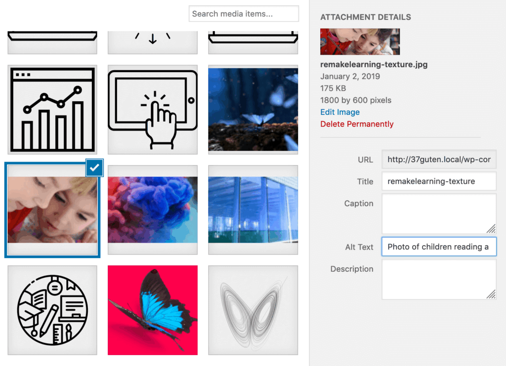
Text Alternatives for Non-Textual Content
The web has evolved into a media-rich landscape. While engaging, content that’s in anything other than a text-based format can be inaccessible to those using assistive technologies. A screen reader doesn’t know what’s depicted in an image, and therefore can’t describe it without your manual assistance. A podcast can’t be consumed by someone who’s deaf unless you have a transcription.
Make it a practice to provide alternate text, or “alt text” for any images you insert into a page or post. Act as if you are describing the image to someone who cannot see it, and describe it well enough that they can still understand what the image is about. This can be done right in the WordPress editor.
For video clips, audio files, or diagrams, provide transcripts or summaries either on the same page or in an easily accessible, linked location.
In short, any time you’re adding content other than text, ensure there is an alternative format where someone who couldn’t see or hear can still consume it.
Ensure Adequate Color Contrast
While discussed in the theme selection, this bears repeating. The WordPress editor allows you to adjust foreground and background colors, which means you could make inaccessible color selections.
Again, WCAG 2.0 AA requires a minimum of a 4.5:1 ratio for normal text and 3:1 for larger text (bold 18px or standard 24px and larger). For more on testing contrast combinations, see the testing section.
Descriptive Links
Most assistive technologies allow users to navigate through a page by jumping from one link to another. This can be an efficient way for users to quickly navigate to the next page in their journey. This feature is not effective, however, if the links added to a page are not self-evident.
Basic Accessibility Testing
Testing is the only way to get a clear understanding of how accessible your website is. That is to say, if you’re just assuming your website is accessible, it probably isn’t. There is a whole range of accessibility testing tools, ranging from free and basic to expensive, enterprise solutions. I’m going to cover some of the more everyday testing solutions.
Tools like axe
Deque’s own axe is a great starting point for accessibility testing. You can start with the free version (which is still extremely full-featured) and sign-up for additional free beta features as you become more familiar with the tool. Axe is a browser extension that allows you to analyze the current state of a page to get a list of accessibility issues and suggestions for best practice.
The added beta features have additional capabilities for more thorough testing, such as guided tests and a defined test scope.
Using Keyboard Navigation
A simple accessibility-testing technique you can use is to navigate your own site using a keyboard. Start at the top of a page and use Tab and Shift + Tab to traverse up and down the page, paying attention to whether you can access all the links in your menus. Also make sure that it’s clear what element it is you’re focused on at each point.
VoiceOver/iPhone (Mac)
If you’re using Apple products, you can use built-in accessibility applications like VoiceOver to test your site and pages for screen-reader accessibility.
On a desktop, VoiceOver can be enabled with the following steps:
- Click on the Apple menu button at the top-left corner of your screen
- Navigate to “System Preferences”
- Click “Accessibility”
- Click “VoiceOver”
- Click the checkbox next to “Enable VoiceOver”
On an iPhone or iPad, it can be enabled with the following steps:
- Go to Settings/Accessibility/VoiceOver and enable VoiceOver
- Summon Siri and say “Turn on VoiceOver” or “Turn off VoiceOver”
- Triple-click the side button (on iPhone X or later)
- Triple-click the Home button (on other models)
VoiceOver, like any screen reader, has a learning curve. As it’s designed for non-sighted individuals, there are keys, shortcuts, and gestures you’ll need to use and understand to navigate your desktop and through web pages.
Apple has comprehensive references for desktop and mobile devices to get you started.
NVDA (PC)
If you’re testing on a PC, you’ll want to use NVDA by NV Access. This screen reader is free; continued support and updates come from donations and grants. NVDA has an extremely robust user guide, and NV Access offers a range of training resources, should you need additional assistance learning how to use the tools.
I find that using a combination of testing methods and tools is important for maximizing accessibility and WCAG 2.0 AA compliance. Automated tools like axe are great for identifying issues in code, CSS, and content. There is no replacement, however, for actually experiencing the site using assistive technology like screen readers or navigating sites using a keyboard. Axe also has some features available in beta for manual guided tests, which can help you bridge that gap.
Conclusion
Web accessibility isn’t a simple topic, especially when it comes to WordPress. As you’ve learned, WordPress is well suited for creating an extremely accessible front-end experience. While the new Gutenberg editor and admin experience has room for improvement, overall, it’s a good foundation for an accessible website- and content-authoring tool.


![[Tutzies homepage, tab annotations]](https://www.deque.com/wp-content/uploads/2020/03/Picture1-1.png)
![[Tutzies homepage, buttons and links annotations]](https://www.deque.com/wp-content/uploads/2020/03/Picture1-2.png)
![[Tutzies homepage, accName annotations]](https://www.deque.com/wp-content/uploads/2020/03/Picture1-3.png)
![[Tutzies homepage, Headings annotations]](https://www.deque.com/wp-content/uploads/2020/03/Picture1-4.png)
![[Tutzies homepage, Roles annotations]](https://www.deque.com/wp-content/uploads/2020/03/Picture1-5.png)