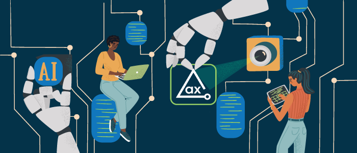
As the world’s leader in testing digital assets for accessibility, Deque is dedicated to providing tools that enable developers to create accessible products at the highest possible velocity. At the same time, we’re also committed to delivering high quality testing according to fully scalable and constantly improving delivery models. These requirements mean we must automate as much as possible, but we have to do that intelligently and with a clear focus on the most important part of accessibility–the people who use it.
Working with in-house development teams to bring our vision of digital accessibility to life every day isn’t just a personal goal for us. It’s about making sure that we never forget the people at the heart of what we do. This perspective is clearly reflected in our unique approach to machine learning, and, in particular, how we use our data and computer vision.
Computer vision, as we define it, is a term for the way that computers and software technology can help people gain enhanced understanding of digital assets. We use it in very targeted ways to overcome specific challenges in manual testing for digital accessibility.
In this post, I’ll explain how we achieve this.
Unparalleled Accessibility Testing Dataset
Deque created the world’s most widely used accessibility testing library, axe-core, which, as of last count, has more than 600,000,000 downloads. We have also performed tens of thousands of assessments for thousands of companies on hundreds of thousands of UI screens. We have hundreds of thousands of weekly users of our free products.
We use our database of past assessments to prioritize the most frequently occurring UI patterns and the most frequently made accessibility errors. The data submitted by our users is used as input into our state-of-the-art machine learning data pipeline to achieve best-in-class machine vision capabilities.
Human-Centered Approach
The data we collect about accessibility issues isn’t just raw information, either. It’s made more relevant by adding real testing results that have been approved by real people using our products. Our digital accessibility testing library constantly improves as users volunteer to share their anonymized data with us every hour of every day. This means that our models are always adapting to the latest state of the art in UI patterns and trends.
This generates a truly smart and dynamic kind of artificial intelligence we use to support computer vision. Prioritizing based on real-world data means that our capabilities address real, practical human needs.
To keep moving in the right direction, we challenge ourselves to think about what elements of accessibility testing actually need a human in the loop. As a result, we developed and use multiple computer vision models that, when combined with semantic information and heuristics, provide highly-advanced automation capabilities on top of what axe-core provides as a rules library.
We use this in several highly targeted areas of digital accessibility testing to produce faster, more accurate results with less manual effort. We selected these areas because they pose particularly tough challenges to manual testers.
Here are a few examples of our computer vision solving real problems:
1. Problem: What is this on the screen?
Typically, accessibility testers have had to look at something on-screen and say, for instance, “That’s a data table, but that similar-looking thing is a layout table.” Humans are very good at cutting through size, shape, and color variations to detect object purpose. But this can take a lot of time, and isn’t always exact according to standards.
So, Deque uses an object detection model we’ve developed to identify and classify user interface (UI) objects. This model is specialized to handle the unique nature of UI object detection. Our model effectively evaluates varying aspect ratios and sizes of UI objects as well as the high density of objects in a UI. It also analyzes the relationships that these UIs have to each other.
These kinds of objects present challenges to many computer vision models because they can include many different kinds of elements that all look completely different. For example, they can have layout tables that span almost the entire UI, and objects that are small and blob-shaped–such as icons or check boxes. They can also have sliders or menu bars that are short and very wide, or objects like vertical navigation or menus that are very tall and thin. How can software tell the difference?
Next, our unique object detection algorithm encodes information about the relationships between objects, providing context for each item. This small step alone vastly improves what the software can accurately detect. For example, knowing that there is a navigation bar present offers clues as to what else there may be inside of that object–such as other navigation Items, search fields, and more.
Our technology then combines this classification context with semantic information, such as from the DOM in a web application. Finally, it combines this with user input collected by our tools, such as in an Intelligent Guided Test (IGT), to determine the presence of accessibility issues.
Axe DevTools also takes into account that a single item can map to multiple potential semantics. We always adhere to the axe-core manifesto of zero false positives. Our goal is to decrease the effort required to produce accessible user experiences from end to end–not to identify the largest number of “maybes.”
2. Problem: What goes together?
Human testers can typically recognize text that tells them what to put in an input field on a web page, but how many of these fields need to be tested? How long will that take?
To determine “what goes with what” without a manual, painstaking search-and-discover approach, Deque uses an optical character recognition (OCR) model to generate the text associated with form labels and use this text to validate accessible names for form fields automatically. It’s fast and accurate.
3. Problem: Are there any hidden color/contrast issues?
Advanced cascading style sheets (CSS) and advanced design techniques can introduce hard-to-find color/contrast issues–such as text on top of a gradient or image. This can, once again, create time-consuming, painful manual testing requirements.
To eliminate this need, Deque uses automated visual text renderings and background checks to calculate the range of color contrast values it finds and show them to the tester, saving enormous amounts of time finding issues that might otherwise remain hidden.
4. Problem: How do you check the many different states that can exist in a modern UI?
Modern UIs have multiple states and combinations of states that need to be tested. On top of this, WCAG standards continue to increase the complexity involved in testing these states. Once again, it looks like a long, manual process ahead.
Not with Deque. Our technology uses a combination of automated triggering of different states combined with visual renderings of these states (e.g. focused versus unfocused) to evaluate whether visual focus indicators exist and if they pass required thresholds pass required contrast and perception thresholds. In fact, our model for this solution already supports WCAG 2.2 requirements.
Conclusion
AI and machine learning are hot topics today. It’s fun when sci-fi authors talk about AI beings roaming the workplaces of tomorrow. However, it’s even more fun when computer vision powered by practical AI and ML makes accessibility easier for everyone–including developers.
Contact us today to see how Deque’s intelligent computer vision can help you simplify accessibility testing.


