We’re starting off the new year with a release full of improvements in the latest release of the axe extension.
The most noticeable of this release is the new highlighter look, positioning, and functionality. We’ve spent the last couple of months tracking down a number of reported issues and we’re continuing to make changes based on user feedback.
New Highlighter
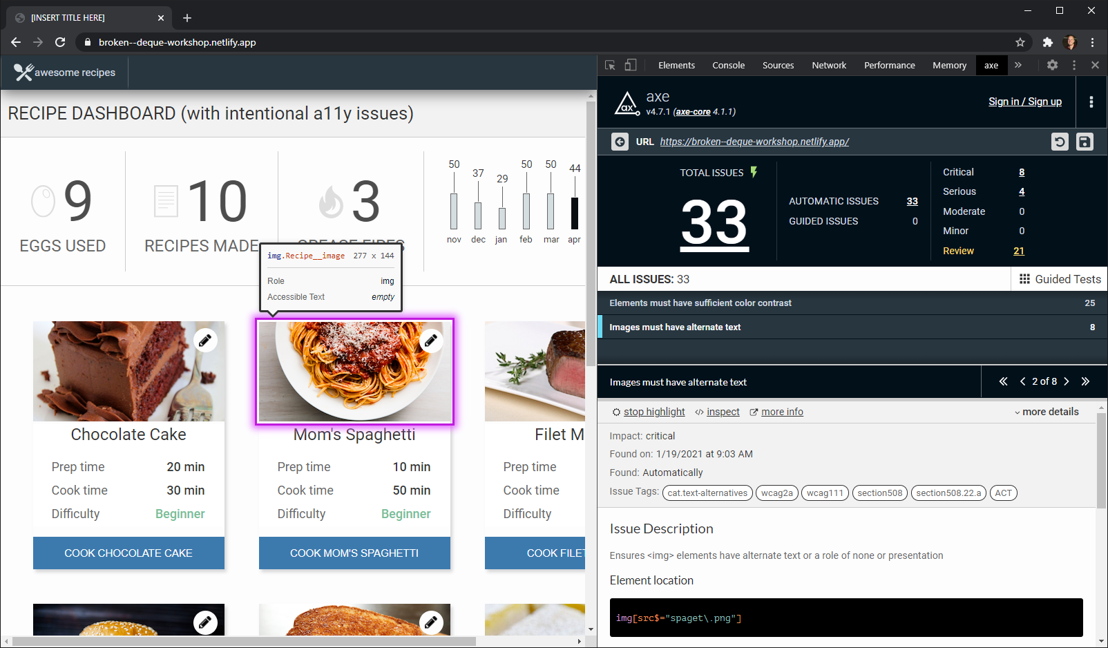
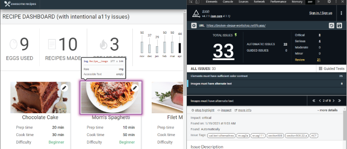
One of the most exciting improvements we’ve made to the axe extension is reworking how the highlighter works. In addition to making the visual indicators stand out more, we’ve also added information about the element that is being highlighted. The highlighter also has the ability to indicate elements that are off the screen, such as skip links, making it much easier to assess tab order with things such as the Keyboard Intelligent Guided Test.

Screenshot of new highlighter in the axe extension.
Performance Improvements
We’ve also taken a close look at performance and are happy to report we’ve made significant strides in making the extension more performant. Tests now save and load much faster and intelligent guided tests should feel much snappier. We’ve also changed how we save the manifest, so users who may have had issues on particularly large sites will no longer have issues saving their tests.
Lots to look forward to in 2021!
As we look forward to the year ahead, we’re excited to share our plans for an accelerated release cadence. Our goal is to make accessibility testing as quick and simple as possible and to uphold that commitment we are looking to deliver value much more quickly and act upon user feedback. As such, you can expect to see the next release of the axe Extension in a few short weeks with a number of usability improvements based on user feedback.
Sign up for the axe beta today and try Intelligent Guided Tests, test a part of the page, save and share results, and more. The beta is free for a limited time.


