Successful digital accessibility programs run on great data. Without it, you can’t report on your progress or drive the right conversations around accessibility improvements with your stakeholders.
That’s where axe Reports comes in.
Available in the axe Platform, axe Reports is Deque’s enterprise-ready tool designed to help your organization track progress, pinpoint risks, and quickly identify areas for improvement.
Now, axe Reports 2.0 allows you to make tangible accessibility improvements at scale.
What’s new in axe Reports 2.0?
Here are just some of the ways you can use axe Reports 2.0 to review trends, organize data, drill deep into dimensions, and more.
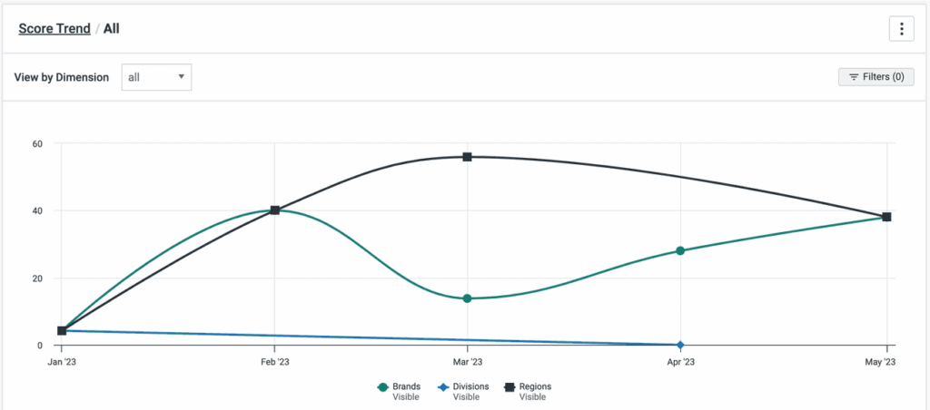
1. Broad trends across your organization: See your organization’s accessibility score across all your sites each time you log in. Select a point on the chart or table to review trends and understand what’s contributing to that score.
2. More flexible dimensions: Create custom categories to organize your accessibility data. For example, you can create dimensions for different products, regions, and departments. With axe Reports 2.0, your test cases, scripts, and projects can be added to multiple dimensions, giving you maximum flexibility over your reporting.
3. Granular reporting with subdimensions: Add subdimensions up to five levels deep. With that level of precision, you can get granular reporting in a few clicks that shows a bird’s-eye view of your entire program. Subdimensions also allow you to find exactly which sites and results are impacting your organization’s accessibility score so you can focus your efforts on improving those sites.
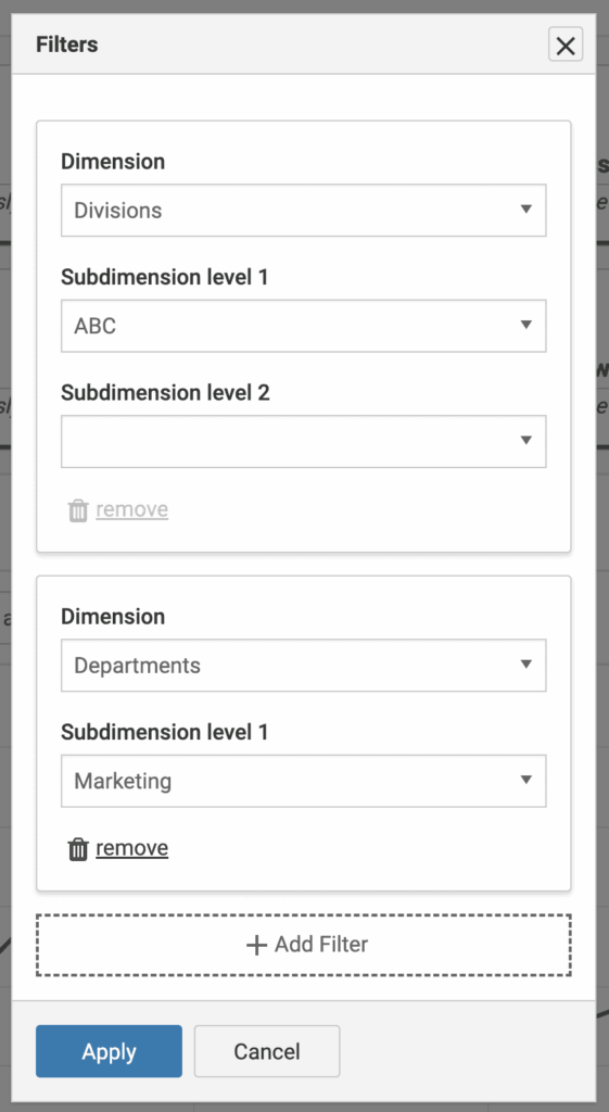
4. Data slicing across dimensions: Make sense of the large datasets across your departments, brands, and regions by slicing your data and analyzing trends. Use the new filtering capabilities across dimensions to get cross sections of your test results.
How to use axe Reports to make data-driven accessibility improvements
Once your sites are categorized into dimensions and subdimensions, you have several options to help you take action on your results.
Let’s say you’re an accessibility program manager who wants to know how sites managed by different teams are doing. You can start by drilling down into the dimension: “Departments.”
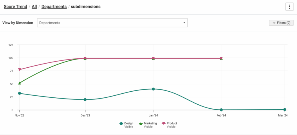
Here, you notice that marketing and product sites stopped testing in February. You make a note to follow up with those departments. However, your biggest concern is that the design department has the lowest accessibility scores, having dropped to 0% in February. So, you dig into what’s causing that.
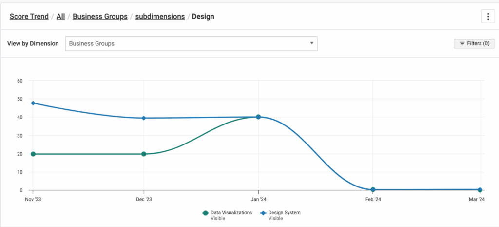
When you select “Design” on the chart or table, you get the two subdimensions you created for the design departments: Data Visualizations and Design System. It appears that the 0% accessibility score is due to a Design System department issue introduced in February. This gives you a useful talking point for your discussion with the Design System team. Now, you can take informed action to improve that accessibility score.
You also notice that the Data Visualizations department stopped testing in January. Since it’s election season, the political infographics are your top priority. You want to investigate whether these sites are at risk and why you stopped testing (another talking point).
When you filter by the department “Data Visualizations” and the division “Politics,” you can find which sites have the highest accessibility risk this election season.
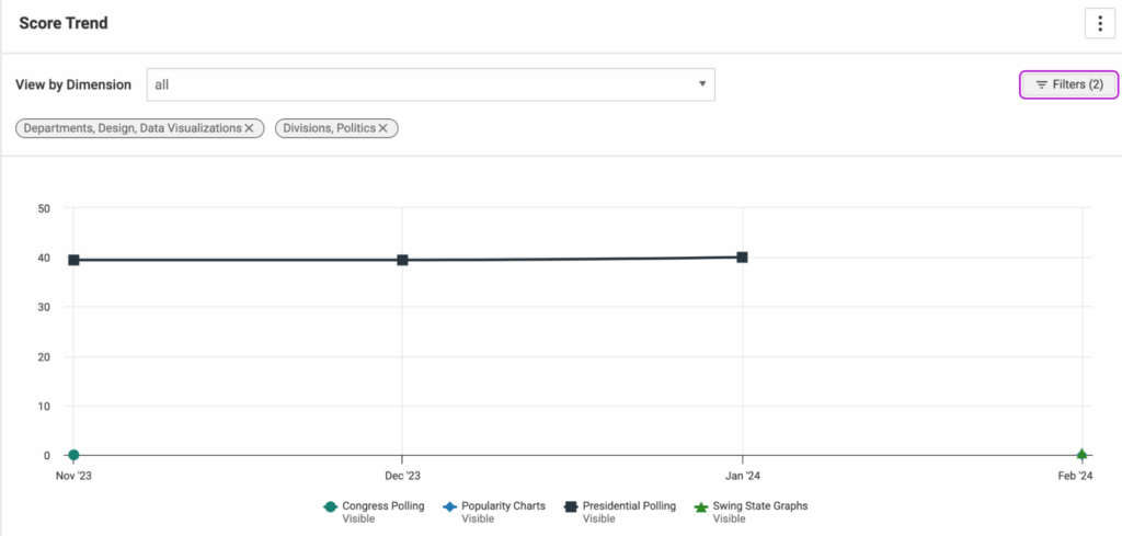
This graph shows that Congress Polling, Popularity Charts, and Swing State Graphs all have 0% accessibility scores and were only tested once (as indicated by the single plot points on the x-axis). This means they have critical accessibility issues. Presidential Polling has a 40% score that didn’t change in November of 2023, but it hasn’t been tested again since January.
Now that you’ve drilled into the data, you can select the site from the trend line on the graph or table to go right to the results in axe Monitor.
Using the details from axe Monitor, you can talk to your team and urge them to take specific steps to help make your data visualizations more accessible. Once they fix those issues and send new results to axe Reports, you’ll see our organization’s score improve.
Dynamic metrics and actionable insights with axe Reports 2.0
With axe Reports, you can track accessibility insights more efficiently, saving time, money and resources by focusing on high-priority issues. Eliminate the guesswork and make data-driven decisions across your organization.
Axe Reports is currently available as a unified view across the axe Platform—including axe DevTools, axe Monitor, and axe Auditor. Learn more about the latest version of axe Reports in the release notes.
If you’re not using axe Reports today, request a demo to see how axe Reports can help your organization track and report on your accessibility progress over time.