
Accessible forms are essential for creating an inclusive digital experience, ensuring that all users — including those with disabilities — can easily complete and submit information. Well-designed forms improve usability, making it easier for individuals to navigate fields, understand labels, and avoid errors. Beyond enhancing user functionality, accessible forms are also a key requirement for compliance with regulations like the European Accessibility Act (EAA), the Americans with Disabilities Act (ADA), and the Web Content Accessibility Guidelines (WCAG). Organizations that fail to meet these standards risk legal consequences, reputational damage, and lost business opportunities. By prioritizing accessibility in form design, businesses can improve user engagement, expand their audience, and demonstrate a commitment to digital inclusivity.
How Accessible Web Forms (or Inaccessible Web Forms!) Affect Our Daily Lives
Recently, I tried to order a cupcake on a new website and I utterly failed. I selected my choice of cake, added it to cart, tried to fill my delivery address and there started the road to chaos.
When I filled the details and submitted the form, a message saying “Please fill Address line 2” arose. Somehow, I sailed through and went to the “payment” section. Every time I clicked “submit,” it gave the same message: “please fill in the required field.” I scanned the forms to see if they gave any clue identifying these mandatory fields, but this effort was in vain.
Then, someone told me that the fields that were required would show in red color if they weren’t completed. If a person without disabilities couldn’t grasp these simple things while filling forms, I could imagine how people with visual, physical, and cognitive disabilities would feel.
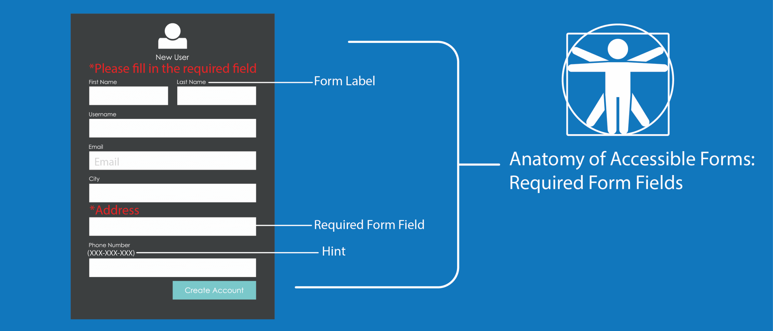
Websites and mobile apps collect a wide variety of data using the forms. Most of these forms have required fields which means the user must fill these fields in order to submit the form successfully. There are multiple ways of providing this cue that a particular form field is required. Below, we will explore each of the methods.
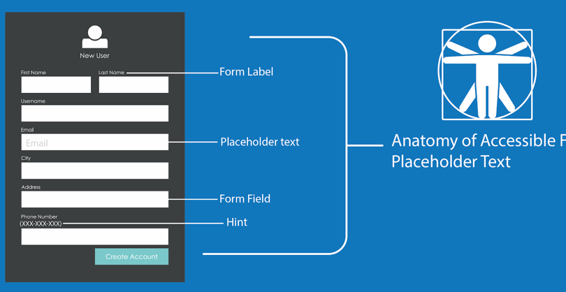
This is the second blog post of my series on accessible forms, feel free to check out the first post in our series on placeholders.
How to indicate a required field
Clearly indicating a required field improves form usability, helps users complete forms accurately, and ensures compliance with accessibility standards like EAA. To do so:
- Provide the required text in the label.
- Provide a graphic * image in the label with appropriate alt text.
To indicate a required field, use a star (asterisk) symbol, incorporate color to visually identify required form controls, include HTML5 and ARIA required attributes, and provide clear “Required” text within the label.
Providing the Required Text in the Label
This method is one of the oldest techniques, the text required is provided within the visible label. For this method, both users who use assistive technology and non-assistive technology users will know which form control is required because it is exposed through the label.
Syntax
<label for="fname">First Name Required</label>
<input type="text" name="first-name" id="fname">
Preview
Since the required text is part of the label, it is always visible and assistive technologies will expose it to screen readers if the form controls are programmatically associated.
Provide a Graphic * Image in the Label with Appropriate Alt Text
Sometimes, the described method above is not appealing to some designers. Some prefer to provide an image which conveys visually that the particular form control is required. For example, if the image is provided with appropriate alt text and the form controls are programmatically associated then the image, this method is accessible to assistive technologies.
Syntax
<label for="fname"> First Name <img src="example.jpeg" alt="required"></label>
<input type="text" name="first-name" id="fname">
Providing Star (Asterisk) Symbol
This is one of the most widely-adopted methods to notify the users that a form control is required. A star (asterisk) symbol is provided along with the label. If the label is programmatically associated with form control, then it is accessible to assistive technologies. For screen readers to expose the “*” symbol, the punctuation settings should be set to most. Sometimes, if the punctuation is set to some or none, then screen readers ignore the special symbols.
While all screen reader users might not know how to set the verbosity settings, it is best practice to use this method in conjunction with another available method as a fallback. Users must be notified that all fields marked with asterisks are required before the form, since the default asterisks symbol is small in size it should be made large enough so that all users can perceive it.
Syntax
<p>All fields marked with * are required</p>
<label for="first-name">First Name *</label>
<input type="text" id="first-name" name="first-name">,
Preview
All fields marked with * are required
Use Of Color to Identify if a Form Control is Required
Often designers use color as a method to identify if a form control is required. When a user moves into the form field or moves out of the form field, the form control changes to a red color. This method is not recommended as it is not accessible for users with low vision, colorblind users, users with cognitive disabilities, and users with visual disabilities. This method can be implemented if there is an alternative fallback method that is “a visual cue,” which can help all users identify if the form control is a required field.
Providing HTML5 and ARIA Required Attributes
The “required” attribute was introduced in HTML5. If this attribute is used on any form field, it is identified as required by assistive technologies. Please note that when a required attribute is used on a form control screen reader announces that field is required and also invalid. Once the form field is filled, the “invalid” notification will not be announced to screen reader.
Syntax
<label for="first-name1">First Name</label>
<input type="text" id="first-name1" name="first-name" required>
Preview
Similar to the“required” attribute in HTML5, WAI-ARIA introduced the “aria-required” attribute. If this attribute is used on a form control it will be exposed as required by assistive technologies.
Syntax
<label for="first-name2">First Name</label>
<input type="text" id="first-name2" name="first-name" aria-required="true">
Preview
While the HTML5 and ARIA required attributes help assistive technology users, there should be a mechanism for sighted users to identify the required form controls through a visual cue like an asterisk (*) or a graphic. Some assistive technologies and browsers might not support these attributes, so it is a best practice to also have a fallback option.
Accessible Web Forms and EAA Compliance
The European Accessibility Act (EAA), effective June 28, 2025, mandates that products and services within the EU meet specific accessibility standards. While the EAA does not explicitly detail requirements for form fields, it references the harmonized standard EN 301 549, which incorporates the Web Content Accessibility Guidelines (WCAG) 2.1 Level AA.
These guidelines emphasize the importance of accessible forms, including clear identification of required fields, to ensure usability for individuals with disabilities. Therefore, to comply with the EAA, organizations should design forms that align with WCAG 2.1 Level AA criteria, ensuring all users can effectively interact with their digital content.
Turn to Deque for Help With Accessible Web Forms and Other Compliance Issues
Ensuring your forms are accessible is a critical step in creating an inclusive digital experience and meeting compliance requirements under regulations like the European Accessibility Act (EAA), ADA, and WCAG 2.1. By properly labeling required fields, using clear instructions, and implementing best practices in form design, you can improve usability for all users, including those with disabilities.
If you have questions about accessible forms or need expert guidance to meet compliance standards, Deque is here to help. Our accessibility experts provide the tools, strategies, and support needed to ensure your digital experiences are fully accessible and compliant. Contact us today to get started on your accessibility journey.
