iOS Updating Content

This post was co-authored by Chris McMeeking and Jennifer Dailey.
Updating Content consists of elements that constantly change, such as clocks and scrolling advertisements. Unlike dynamic elements that only change through user action, items that constantly change should not have every update recognized by VoiceOver. Implementing updating content in this way will make the app more difficult to navigate and use for VoiceOver users. However, this should not be counteracted by not making the element an accessibility element. Unsighted users should receive the same information through VoiceOver that sighted users obtain through visual UI.
The Clock Problem
Every situation will be slightly different as to the best way to implement accessibility for updating content. It should have enough accessibility that VoiceOver users know what is focused and have a general sense of its content; however, it should not have so many notifications from VoiceOver that it disrupts usability and functionality of the app. Let’s say that I want to implement a clock displaying the current hour, minute, and second. When a user focuses the clock, it should not announce the time every second because VoiceOver will not be able to fully state the time in a second. It will fall behind on notifications very quickly and relay outdated information to the user. (So, the clock may display 4:25:45 PM, but VoiceOver will say that it is 4:25:42 PM.) The clock needs to be accessible, but in a way that keeps it from presenting outdated information to VoiceOver.
Scrolling Advertisements
Scrolling banners and advertisements represent a different challenge. In the case of the clock, we are not necessarily interested in all of the content the clock has ever represented. If we miss a second or two, that’s okay! However, in the case of scrolling advertisements, there may be information in there that a user wants to inspect further. What if while the user is listening to the announcement for one advertisement, the banner has changed to the next? Can the user return to this advertisement? How far behind have they gotten? For a VoiceOver user, the answer to these questions isn’t necessarily simple, and such cases need to be handled with care.
Potential Solutions
Please note that these solutions may not be optimal for every scenario. As stated before, every situation with updating content is different, so the solutions as to how to make updating content accessible will rely on the situation. Listed below are some potential ideas as to how to make these elements more accessible.
Reconsider User Interface
One fix is to consider removing non-essential information from the UI. Let’s go back to the clock example. Are the seconds on a clock really essential information? In some cases they are, and in these cases other solutions are necessary. However, if the clock is really just a time keeping clock (and not say a stopwatch) the argument could certainly be made that the seconds are not necessary. In such a case, removing these from your UI may be the best solution. The minutes certainly update infrequently enough, to not create a problem with VoiceOver.
NOTE: It may be tempting to set the Accessibility Label of the clock so VoiceOver only reads off hours and minutes, keeping the seconds available to sighted users. This is an instance of hiding textual, informative information from VoiceOver, and is not accessible. To pass WCAG 2.0 guidelines, all informative information must be available to
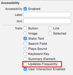
“Updates Frequently” Trait
When UIAccessibilityTraitUpdatesFrequently trait is applied it causes VoiceOver to pole periodically for updates, rather than announcing every change. If an element updates constantly and VoiceOver is unable to keep up with the updates when focused, the “Updates Frequently” trait might help. This is the preferred solution for our Clock example, if UI/UX changes are not acceptable.
Start/Stop Button
What about the scrolling advertisement problem? What if I made an advertisement banner that updates every 10 seconds. VoiceOver focuses on the progress bar and states “Progress Bar Complete.” If the VoiceOver user wanted to read a long paragraph, VoiceOver may, in the middle of the paragraph, switch focus to the progress bar because it completed another cycle. This would make the paragraph inaccessible to VoiceOver users. To fix this, implementing a start/stop button, in which the user can stop the progress of the bar so as to access other elements on the page, may solve the problem.
Best Practice
When in doubt, applying the Updates Frequently trait can’t hurt. If applied to an element that doesn’t update frequently enough to matter, the behavior will still be reasonable. However, if there is content within the frequently updating element that a user may be interested in, a pause/stop button should be provided. Mobile apps tend to be highly focused in purpose and dynamic updating content can be distracting. Reconsidering your UI/UX may be the best overall solution.
Thank you for reading! If you found this helpful and want to learn more about accessibility, check out our other accessibility tutorials on our other blog posts and our Deque University for iOS app, available on the App Store!
Learn more…
- Read more Deque University Best Practice posts.
- Sign up for a mobile accessibility webinar.
- Discover how Deque products can help you make sure your apps and websites fully accessible.
